“A forest is full trees, but what we don’t always see at first glance is it is filled with insects too”
As a curator and within my retail environments, what I work to create for visitors are spaces that allow a relaxation of the senses, so that people could be present. Unencumbered by restrictions on bodies and using visual cues to help dial back the reptilian brain, meant that we could enter into speechless conversation. I learnt the following ten rules by reading, observation, constant adjustment and conversation. These rules governing the curation of spaces or UX design of space could assist with the curation of the XR, Augmented Reality and Virtual Reality.
To make it easier to get through the entire ten, I will break the article up into two sections. This is part one with five rules.

Start at the beginning with Navigation. Within Kin, we arranged our stores as openly as possible, always focusing on allowing the visitor to comfortably move in both directions. This was to ensure a visitor didn’t get stuck at the door in a traffic jam or leave because their path was blocked. However, what I found most often was that visitors moved left. I found this in exhibitions I curated too. I attributed this to the reading experience in the west, where we read from left to right.
More recently, it has been said to be related to driving – if you drive on the right side of the road, you’ll turn right, while if you drive on the left, you’ll turn left. By this logic, British, Australian, Japanese and visitors from many African countries would immediately turn left on entering a gallery or store, while Americans, UAE and most Europeans would head right.
 How do we allow for ease of movement through spaces? And when is it a good idea to hinder movement, for example, in gaming? How do we account for movement in the UX design of virtual worlds?
Creating a space for even those who feel all elbows. I came to realise that not everyone would be comfortable in the spaces I created. But the truth is that not every space is for every person. A focal point is important in developing virtual space, create too much noise and you can potentially lose your visitor, but too little visual stimulation can be boring. My intention in physical space is to create a feeling of safety to ensure that the visitor moves through the space in a way that allow for conversations. Virtual space can be used in the same way. Think of why you want someone there and find ways to ensure that the environment is built for that purpose.
This leads well into a discussion of the third rule; space. When looking at space, I think in threes; people, objects and the viewer’s eye. All given equal weight of importance. Much is written about real estate in a retail space, that each cm must be utilised. For me, not utilizing space is as important. It is the negative space that can make or break a retail space or an exhibition in that it allows the visitor to be unencumbered. I always think of negative space in UX design and CX journeys

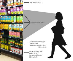
The fourth rule relates to eye Level. In an art gallery, eye level is easy maths, it is between 1,47 – 1,52cm depending on the average height of the citizens in the country you are exhibiting in. In retail, eye level is approximately from the top of the head to the heart. It is also called the buy level. This space is prime real estate and many brands will pay extra to be here. Usually it is reserved for the best sellers. The next level down is the touch level and this is from heart to belly button. Called this because it is within range of children. In UI, visual hierarchy and clear navigation are a great concern, taking this a step into AR & VR, what is eye level? And how do we use eye level in the UX design of the virtual?
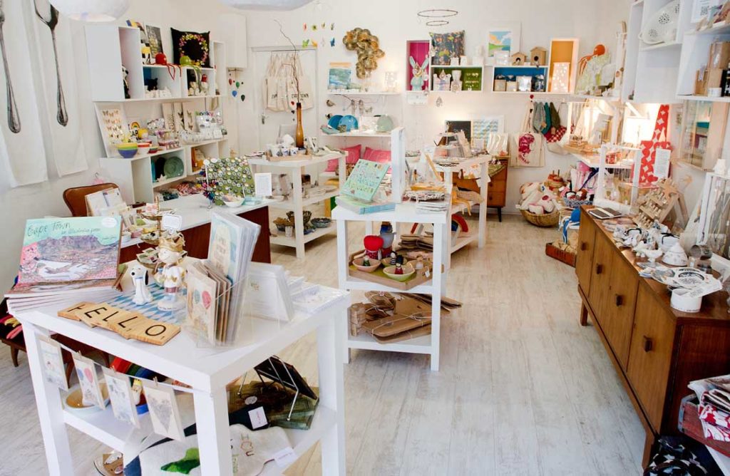
Depth is important in the user journey. Much of the curation at Kin was there to create a depth of field, a horizon line and the feeling of “but wait, there is more”. We relied on this a great deal. The most successful window exhibitions were ones in which the depth of the window seemed far greater than its 50cm’s. Ones in which worlds were created, or in which the depth of the space was divided into three.
 Layers to create depth meant that a person could stand in front of a shelf for a few seconds, just letting their eye drift over each piece. It created a much more interesting display then a row of flat objects like cereal boxes in a supermarket and depth tied in with our ability to create rhythm and narrative.
Depth becomes remarkably more complex in creating an AR and VR world, but the same rigor can apply. Remove and add continually to find a comfort level for the viewer. Do not over clutter, but don’t create simplistic spaces. Space is complex, even without human intervention and UX design. A forest is full trees, but what we don’t always see at first glance is it is filled with insects too.


