A forest is full trees, but what we don’t always see at first glance is it is filled with insects too.
As a curator and within my retail environments, what I work to create for visitors are spaces that allow a relaxation of the senses, so that people could be present. Unencumbered by restrictions on bodies and using visual cues to help dial back the reptilian brain, meant that we could enter into speechless conversation. I learnt the following ten rules by reading, observation, constant adjustment and conversation. These rules governing the curation of spaces or UX design of space could assist with the curation of the XR, Augmented Reality and Virtual Reality. To make it easier to get through the entire ten, I have broken the article up into two sections. This is part two with the last five rules. Please read Part One for the first five.
"If we do not listen, we lose the opportunity to create great work. And ultimately that is why we are here, is it not? We are learning to be better designers of spaces, whether physical, digital or virtual."
The sixth rule is rhythm. Defined as a strong, regular repeated pattern of movement or sound or the measured flow of words and phrases in verse or prose as determined by the relation of long and short or stressed and unstressed syllables. It can be used in sizes, colour, and patterns. It appeals to the senses on a subconscious level. Think about the way one interacts with flooring and sidewalks. The way one speeds up when walking or slows down. Rhythm can be used to draw the eye along, can be used to stop the eye and used to guide the visitor through the space. Focusing on rhythm allows the visitor to drift, which creates a playful mind and the visitor could slip into a childlike feeling. Drifting from shelf to shelf, object to object, allowing dwell time to extend with play.
Angle of the body. Female undergraduates were told to drink glasses of water until they no longer felt thirsty. They were then given a glass containing a new high energy sports drink and invited to drink as much as they liked while watching two videos. One video showed an athlete standing upright with a bell bar which he pulled towards his chest, bending at the elbow. Another video showed an athlete lying on his back, pushing a weight up from his chest, extending his arms. As hypothesised, those watching the arm bending video drank more than those watching the arm stretching. In The Brain Sell, Dr David Lewis concludes that bending one’s arms increases desire.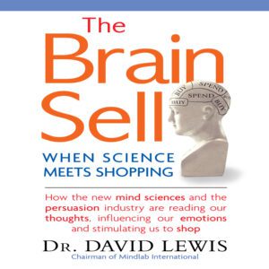
In designing spaces, I stay conscious of the comfort level of my visitors. Arms bent at between 75- 90’ seemed the most comfortable way to travel through a store and we made sure that as much as possible was within that reach, unless it was more fun to reach out or bend.
One of the most interesting use of the angle of a visitor’s body I have seen was at 2016 Dutch Design week. Islamopolitan examined the multiculturalism and diversity within the Islamic world. Curators Giuseppe Moscatello and Khalid Shafar, and exhibition designer Paolomaria Giannotti created an exhibition of international works from several Islamic artists. Each artworks caption was placed on the floor near the work. To read the caption one had to bend at the waist to mimic ruku. This brought the viewer into a movement of Islamic worship and created empathy.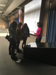
The eight rule is illumination. When one enters a cathedral, the first thing that may strike you is the darkness. But give it a while, slowly the eyes adjust and as one walks deeper into the church and towards the christ figure, light seems to dawn. The coming to god is experienced physically by creating a sacred space that shifts from darkness to light only using the eyes natural tendency to adjust to darkness. Thus, seeing the light of god. From the 12th to 16th century, Gothic architects revolutionized our way of seeing and the importance of not only illumination, but how illumination is experienced. Some people ask how old is UX design? It’s as old as the moment we realised that we could influence a tendency to behave in particular ways creating distinct actions.
Think about the dusky effect of a casino. Neither light nor dark, it is timeless. In a gallery, warm light vs cool light can change the artwork and exhibition completely. Lighting manufacturer Lux improved the sales of one store by 12% by only changing the lighting. One of my first questions when designing an app is the lighting conditions of the environment it might be used in. If it’s in a warehouse, outdoors, in a mine. These are integral questions as anyone checking their phone at 3am will attest to. How is lightening used effectively in your VR / AR UX design experience?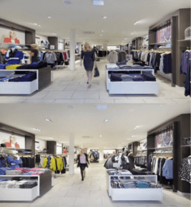
Ninth is story. Story is fundamental to everything when creating a space. At Kin, we use it to change minds, create a belief, or prompt an inner dialogue. In 2009, there was no store selling exclusive SA design so we started as a pop-up and then permanent space. Our central story – SA design is brilliant, well made and for everyone. It is not a memento of a safari trip, although everyone likes a tall wooden giraffe and who doesn’t love animal prints?
At Still Life, it was about placing pottery in a gallery and calling it art instead of craft. During Our Fathers, it was about the inner dialogue one has with one’s self about one’s father. Something that I never expected was that a visitor and artist told me that the exhibition made him reconsider the father he was.
Although every exhibition and retail space has been for me, once it is physically created, it is no longer mine and I improved upon it by allowing others to change it and asking them to. Kin was a collaboration between the people who worked there as well as the visitors who arrived and played. I learned not to get in the way.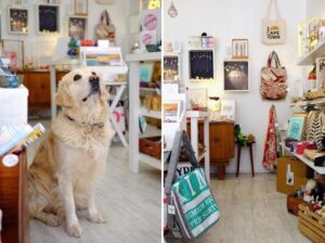
This brings me to my tenth and most important rule; be on the floor. My stepfather worked in Pick ’n Pay’s and worked up to owning his own family store, my mother worked her way from sales rep to national account manager. Their constant advice was be on the floor. As a little girl, I recall having to hunt the endless rows of shelving in a Pick n Pay Hypermarket to find my stepfather while someone asked him to come to the front desk. He was always on the floor. The reason? He could listen. My mother is the same, always listening. Eavesdropping too. Know your audience. And when you think you do, make sure you ask different questions.
I had the most personal conversations about dying family members in a retail store and relationships with fathers in a gallery.
If we do not listen, we lose the opportunity to create great work. And ultimately that is why we are here, is it not? We are learning to be better designers of spaces, whether physical, digital or virtual.
My hope is that when we listen we hear all the voices and our spaces become inclusive, allowing for intense dialogue and heart stopping nuance.

