In March, I gave a talk at the Cape Town International Animation Festival with Gerrit Kruger and then recently adapted the talk for students in animation.
The talk spoke about animation as the language of interaction in Digital products, whether simple smartphone apps and websites, or immersive experiences in games and VR or AR. Most of the audience for both presentations were from a traditional animation background. The goal was to look at the value that animators can bring to to these interactive fields, as well as the challenges that they will face when moving into this new medium.
Animators often follow quite different design and production processes, their medium is linear with no interactive components. We wanted to introduce concepts and techniques to help overcome these barriers. But the interactive mediums are increasingly relying on animation in communication with users, whether that is through simple UI animations or complex character animations, and the animators we were speaking to are experts in this language.
Human bodies
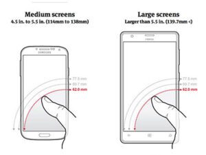
Animators think a lot about how bodies move. But they apply that thinking to characters on the screen, not to how their viewers interact with the work. We introduced them to the necessary considerations of ergonomics. First the simple(ish) ergonomics of using a smartphone, something hey are all familiar with, even if they haven’t thought much of it; the hand size, screen size, right handed or left, small hands, big hands, small fingertips versus large, sweeps to the left or right, close screen x in the right corner. All of these questions and you only have one screen to consider designing for.
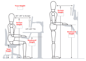
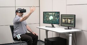
Take that into AR/VR and suddenly the variety of interface, from screens to input devices, increases massively in complexity. We no longer have to focus on how the hand interacts, but we have to consider the ergonomics of the entire body and how that body will fatigue or how much space it is able to use.
Interaction Design
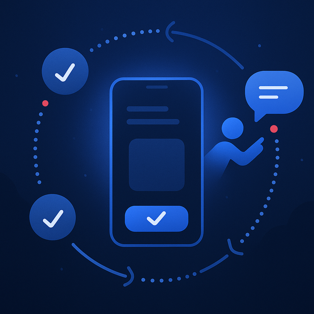
Understanding the foundation of how interactive systems work is essential to understand the role of animation as a language. It helps to understand what the animation should communicate and when. The Model-View-Controller pattern is a simple method of understanding this. The user sees the view and interacts with the controller, this manipulates the model which updates the view which feeds back to the user who continues the loop. Timing and responsiveness is key for the role of animation in the view.
Patterns of interactive narratives are integral to the creation as part of the story but also need to planned around actions. One can compare linear narratives to branching path narratives, looking at methods of managing the complexity that emerges as you introduce interaction and paths for users to take. This is not just a concern of managing complexity, but also important to plan around for production because of the amount of content that needs to be produced once branching paths are introduced.
A practical tool for designing interactive media is a pattern that animators would be intimately familiar with – the three act structure that is followed in most films or linear narratives. This is a pattern that has been widely used in interaction design and specifically animation elements, even micro interactions such as the Facebook emoji reactions. This same pattern can be used as a guide when designing UI or game elements.
Another interaction design tool one can use is mapping the flow state of the user. To ensure engagement in the experience, one must find the right balance of emotions for the user to journey through. Mapping challenge against skill as per Mihaly Csikszentmihalyi to map the users flow state is an incredibly useful method of gaining insight to this. Ultimately the goal is to maintain a flow state that avoids both anxiety and boredom and retains engagement. A second mapping of challenge vs skill results in a guide to how to move the user toward a particular response. Where in the initial concept of the flow state anxiety or boredom are not desirable states for retaining engagement, designers can use this information to move users through a series of responses. As an example, a horror experience: anxiety is desirable in this case, but an experience that is filled with anxiety from start to finish will be less effective than one that moves the user in and out of an anxious state.
Design Thinking as a Process
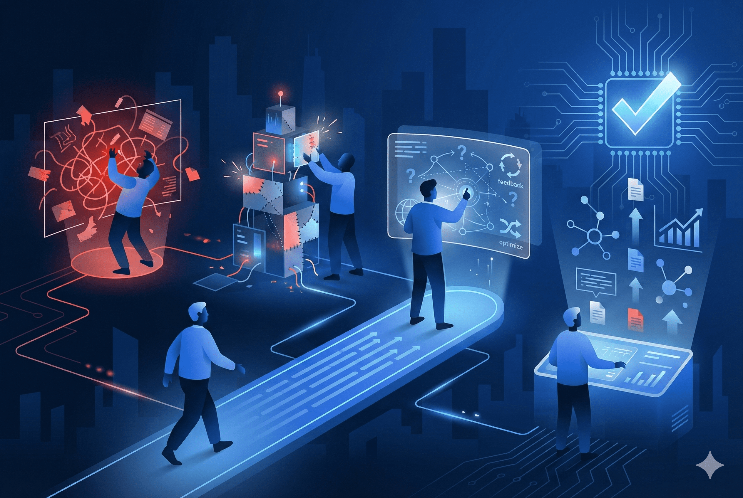
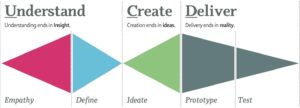
At Polymorph, we are frequently asked about our process. It is based on the Design Thinking principles of understand, empathise, ideate, define, prototype and test. It is always about testing the assumptions made to ensure that as we build, we build something a user will come back to. It is important to evolve the product in the leanest way possible, building simple testable versions and improving them iteratively. This often puts planning and designing animations last, so that they are based on what the software is doing and what we need to communicate to the user.
The above three key spaces are a good start for your journey into animation for VR/AR, gaming and interaction design. Within these ever changing landscapes, the hardware is growing fast. At the moment we are all looking forward to the launch of Santa Cruz. At VR Days, Martin De Ronde from Force Field called the headset a game changer. At Polymorph we have started to work with Sozo Labs and our clients to work towards XR creations and we would like to hear from you if you are working in a similar space in animation.

