VR/AR is fast paced and constantly evolving through creative experimentation and user research. This is strongly focussed on creating and improving user experience. User Experience is our sweet spot, we are devoted to creating products and services with users at the heart of the matter.
The highlight of all of the presentations at VRDays in Amsterdam was how much was shared in terms of the tips, tricks and tools. Presented by those at the forefront of the VR/AR world, we will highlight a few of the tips they shared. This list focuses on retail, but the lessons can be applied much more broadly to VR/AR design.
1. HUGE experience
Your client is going to wear a big, bulky, clunky headset. If you do not deliver an experience that is huge, they will not come back. It has to be worth their while. Think about the computers we used initially with MS DOS; initially many people were antagonized by the experience. As it became fun and interactive, people came back. The hassle of floppy discs and typing evolved into USB and keyboard shortcuts, but only because it was worth pushing through. VR/AR is the same, give your user an experience worth pushing through the challenges.
This leads to…
2. Eliminate the boring
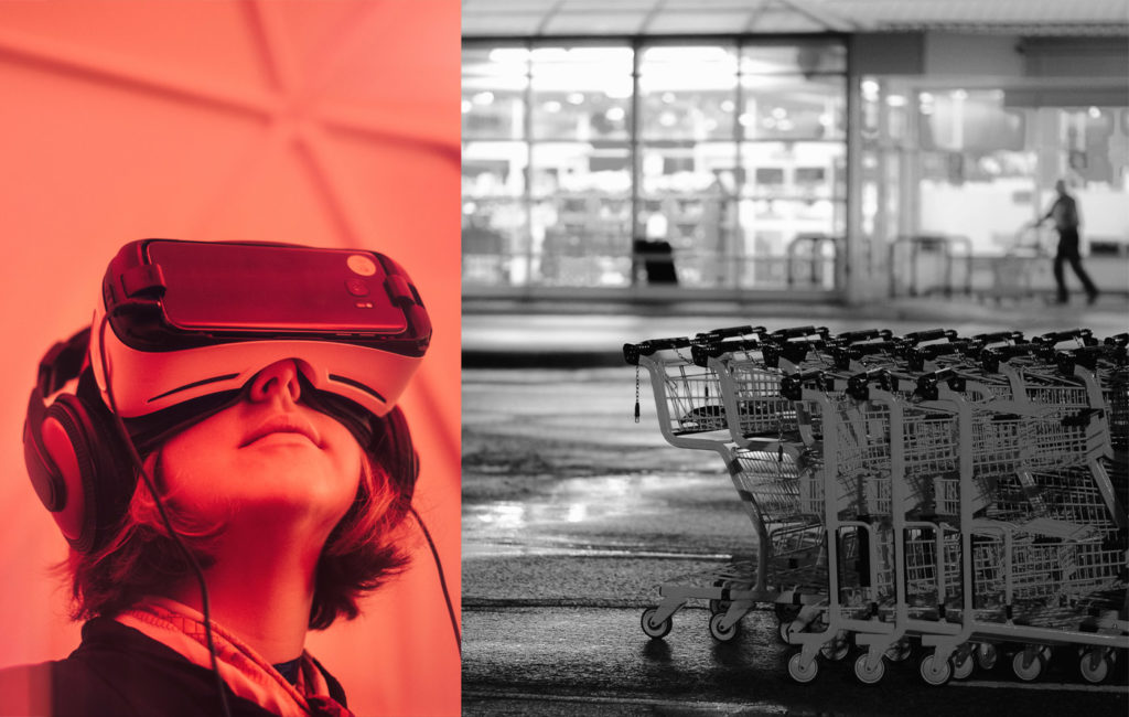
No one likes standing in queues, pushing a trolley or staring at rows of cereal boxes, so don’t do that in VR/AR. Shopping must be reinvented for the VR/AR world with point 1 in mind. Amazon has a subscribe and save service which has a discount algorithm that grows your discount structure as you order more often and more products. People use it for regular purchases like nappies and toiletries. Use VR/AR to reach the clients you already have, to show them new products and introduce them to new ranges or concepts. With new clients, find some new exciting way to use VR/AR to introduce them to your brand.
3. Assist
Help your user. Reduce friction. Don’t expect them to step into VR/AR and know how your virtual world works. Give them a shopping assistant or other clear cues to guide them. Create an assistant infused with your brand personality to guide your user through their VR/AR experience. Make sure that your user can engage with the assistant in ways that are easy and comfortable for them. Don’t forget to add a way for the user to speak to a human if they need to.
4. Learn
Speak to the user, get them to work with you in-store, do your research, put the control in their hands. MediaMarkt created a kitchen range just to learn about how users move through space. That is how important user experience is to the company. Is it that important to you?
5. Understanding space and physicality of VR/AR
As exhibition designers and curators we have long being vocal about the physicality of VR/AR spaces. Research has shown that 12,5% users feel ill, 4,5% experience hot flushes and it’s normal for a user to lose their balance at some point during their experience. 2,5% experience real fear, not because of anything in the VR, but because of fears of being made a fool of, falling etc. If you are working in VR/AR and have no spatial specialists onboard, you need to rethink your team.
One of the big messages was: do not embarrass your user! So although you are testing in-store, have a space that is semi-private and ask people not to videotape their friends and family. Embarrassing your user will tend to make them more fearful of VR/AR tech in future. Perhaps worse than that, doing so will associate your brand with a lack of concern for the user.
This is the first of a series looking at the VRDays conference and the learnings. For more discussion or if you are thinking of implementing VR/AR in your company, please contact us.


