Many product teams, like ours, don’t have a dedicated UX writer/content designer. But, with a bit of a shift in mindset and by making use of the UX skills already on our team, we’ve been able to help our clients build apps that sound human.
So, how do we translate what’s happening on the back end of our software to what’s needed on the other side of the screen so our users get real value out of our client’s products?
Sarah Winters, who literally wrote the book on Content Design, says this:
"Content design is a way of thinking. It's about using data and evidence to give the audience what they need, at the time they need it and in a way they expect."

Founder at Content Design London
Let’s look at that statement again in the context of UX skills:
- Data and evidence = research
- What the audience needs = user needs/Jobs-To-Be-Done
- When they need it = journey mapping
- In a way they expect = relatable language and familiar UI patterns
How to start sounding human without being a ‘good’ writer
Words shape and guide people’s experiences. This is why I have a rule when I’m doing user testing: No Lorem Ipsum. Placeholder copy makes the experience we’re testing less relatable for participants. This rule challenges our UX team to take a first stab at the words and treat them as design elements, not as “a thing I’m not good at.”
How do we approach the words as non-writers? First, we consider the person using the product (including their emotional state) and then their context (e.g. sign-up). Once we understand what’s happening from a user and a technical perspective, we decide what sounds right (saying the words out loud really helps here), and then we revise it together.
We try to keep these 3 best practices from How Words Can Make Your Product Stand Out in mind when we’re writing copy:
- Be clear (i.e. make it about the human problem, not the software problem)
- Use language that your audience can relate to
- Remove technical jargon
- Put the action in the context of the user
- Be concise (i.e. be economical with words, don’t just aim for less)
- Ensure each word has a distinct job (people don’t read every word on the screen, they scan)
- Tailor visual elements to the messaging (and not the other way around)
- Keep the most important text upfront (and ruthlessly edit whatever comes after it)
- Be helpful (i.e. get people to where they want to go)
- Don’t be vague. Use the exact words (you’re not writing to be clever, you’re writing to make it easy for them)
- Write in the active voice
- Provide information that lets the user know what will happen next
Let’s apply these principles together
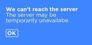
Let me demonstrate these principles in practice with an error message as an example.
This message doesn’t specify the cause of the error or what the user can do to resolve it. It’s also all about the computer problem. Let’s see what we can do to make it more human and clear …

By providing specific and actionable information, the user is more likely to understand what went wrong and what they can do to resolve the issue.
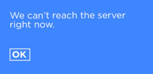
But now it’s a bit wordy and hard to scan. Let’s try to make it more concise…

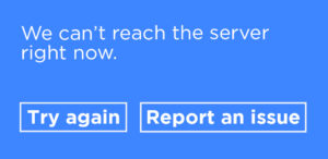
It’s shorter, but now it doesn’t direct the next action. Since we’re putting the responsibility on the user to figure out how to resolve this issue, we need a useful call to action …

Now we’re giving the user specific, actionable steps. And, we’ve realised that we should give the user a solution if ‘Try again’ doesn’t work. Paying attention to the words and who they’re for can uncover some of the basic functions your product needs to offer.
It’s important to note that these 3 principles often compete with each other. When we made our message clearer, it wasn’t scannable. When we made it concise, it wasn’t that useful and came at the expense of some clarity. When we made it useful, it became longer again (and uncovered the need for a whole new feature).
The takeaway
Good UX writing is not an exact science, and there’s no correct answer. It is a collaborative and iterative process. The goal is to provide clear, concise, and helpful information that supports the user’s needs in the most accessible and effective way. And no, you don’t have to be a ‘good’ writer if you understand your users really well.


